A Collaboration
Art and Science
In the early 90’s I was involved in an interesting collaboration with a mathematician Dr. Gottfried Josef Mayer-Kress creating art using chaos computer models. The following article and images were from the Magazine IRIS Universe
At Princeton University I began a collaboration with Gottfried Josef Mayer-Kress working with computer images that he had generated for scientific research in chaos. It was an opportunity for me as a graphic artist to not only work directly with a scientist, but also learn to use the IRIS workstations and Princeton Visualization Tools. When I began the project my sole purpose was to work with the images in order to clarify them for scientific visualization. The images would still be computer models of chaotic systems to be used for science. I regarded them as intriguing scientific images but not art.
In one afternoon I learned how to use the Princeton Visualization Tools, IRIS workstation, and began work. The standard “makemap” color map was used for the initial images I received from Mayer-Kress (figure 1). At first I felt there were too many colors all mixed together, which was distracting. However, there was something intriguing about the structurer of the images. They seemed to flow and move like liquid or vapor and I began to see them as raw material. It was as if I were a painter and had gone outdoors with canvas and oil colors to paint a landscape. The chaos images on the computer put me in mind of the land and sky – I could paint and interpret them as I wished. The flexibility of the IRIS workstation enhancement ed the work, allowing the process to become spontaneous and playful.
My first step was to search the image and determine if there were any inherent patterns. In the interest of simplification I eliminated the mix and jumble of colors. I wasn’t interested in merely creating pretty pictures; I was looking for a movement or a visual tension in the image that sparked my personal vision. Still, I questioned the value of searching for personal visions in images that are essentially models of particle accelerators, chemical reactions, and heart rates. Painting was far more immediate and allowed absolute freedom along with the challenge of blank canvas. Was there then any value to using these images of chaos to create a personal vision?
The image titled Canyons and Mesas (figure 2) originated from the nonlinear mathematical “standard map“ of a torus, was transformed into a brilliant landscape full of waves, motion and color. This torus slice, which had formed a strange attractor in the science model, had become a strange surreal landscape in its art version.
In the image Blue Canyons (figure 3) the color map is a recurrence plot of the heart rate of a pig, but the image was manipulated to create a rugged red landscape creased with deep, mysterious canyons.
Islands (figure 4) began as a model of a chemical reaction and was transformed into ethereal islands floating down a liquid pathway of pink and blue.
In the creating of these abstract landscapes I had discovered for me to create unique images that could not have been achieved in any other way.
The results of this art/science collaboration were entirely unexpected and went far beyond Dr. Mayer-kress and I had anticipated. My intent was to use Mayer-Kress’s images as a poet of departure, a basic on which to create something more than brightly colored computer graphics— as a vehicle for self expression.
While computer visualization technology is encouraging the convergence of science and art, we are also reminded that age old, fundamental differences exist between the two disciplines. Visualization in the sciences is typically used as a means of representing data so that it may be better understood or communicated to others. Visualization as applied int he arts is not so much a representation of data as it is a representation of the artist’s imagination and feelings.
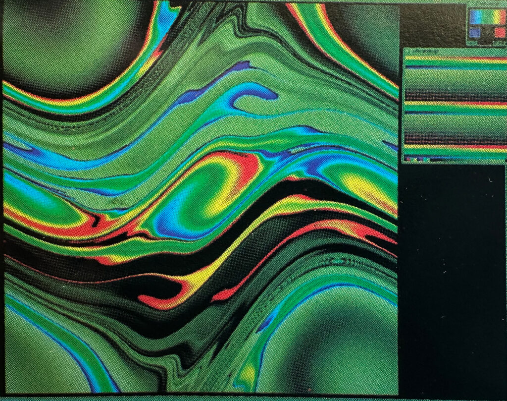
Figure 1: Chirikov standard map. This is the original image before my manipulation.
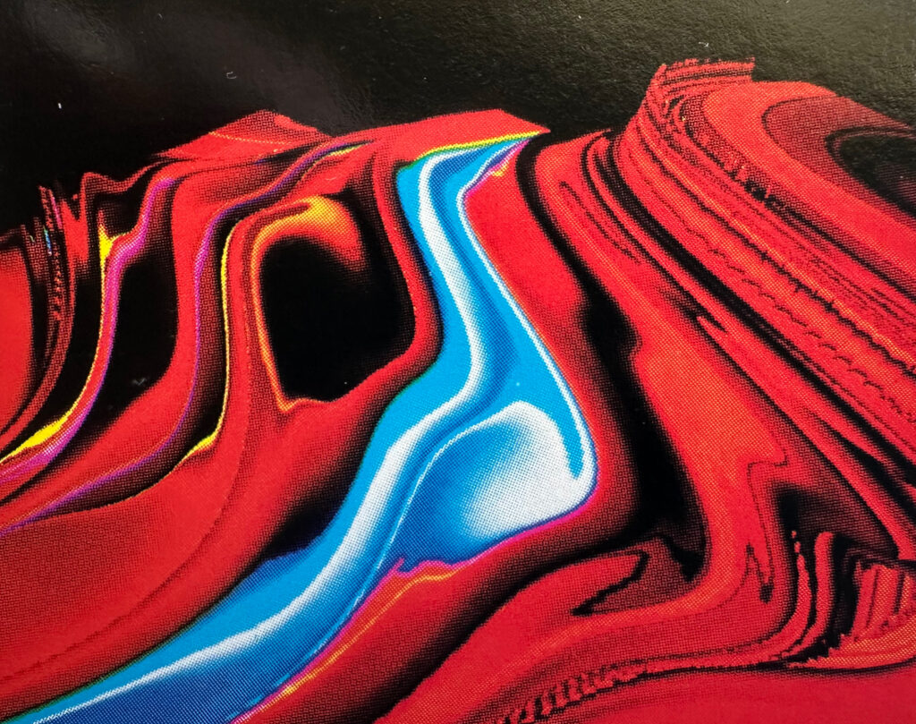
Figure 2: Canyons and Mesas
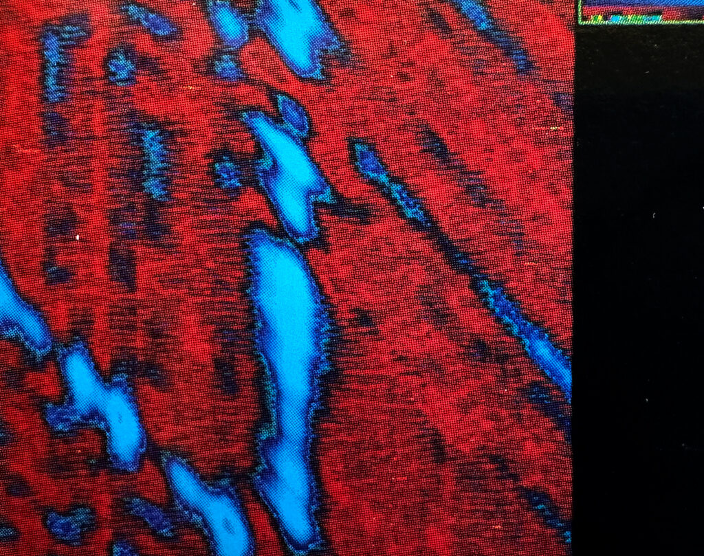
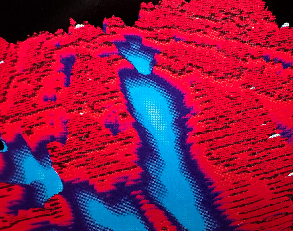
Figure 3: Blue Canyons. The image above is the original image that represents pig heart data.
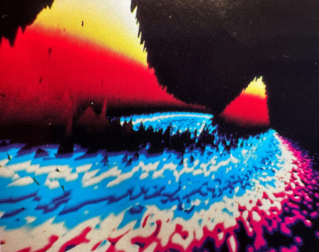
Figure 4: Islands. The original image was used to describe the stability of a model of an oscillating chemical reaction measured against external, randomly variable agitations.
